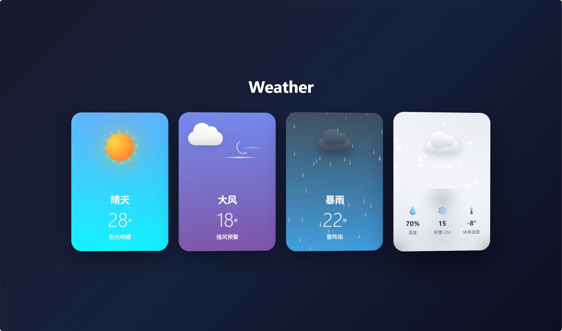
天气卡片测试如下(claude code):
<!DOCTYPE html>
<html lang="zh-CN">
<head>
<meta charset="UTF-8">
<meta name="viewport" content="width=device-width, initial-scale=1.0">
<title>iOS 18 Weather Cards</title>
<style>
* {
margin: 0;
padding: 0;
box-sizing: border-box;
}
body {
font-family: -apple-system, BlinkMacSystemFont, 'SF Pro Display', 'Segoe UI', sans-serif;
background: linear-gradient(135deg, #1a1a2e 0%, #16213e 50%, #0f0f23 100%);
min-height: 100vh;
display: flex;
flex-direction: column;
align-items: center;
justify-content: center;
padding: 40px;
overflow-x: hidden;
}
.page-title {
color: white;
font-size: 48px;
font-weight: 700;
margin-bottom: 60px;
text-align: center;
letter-spacing: -0.5px;
text-shadow: 0 4px 30px rgba(0, 0, 0, 0.3);
}
.weather-container {
display: flex;
gap: 30px;
flex-wrap: wrap;
justify-content: center;
max-width: 1400px;
width: 100%;
}
.weather-card {
width: 280px;
height: 400px;
border-radius: 30px;
position: relative;
overflow: hidden;
cursor: pointer;
transition: all 0.4s cubic-bezier(0.25, 0.46, 0.45, 0.94);
box-shadow: 0 20px 60px rgba(0, 0, 0, 0.4);
}
.weather-card:hover {
transform: translateY(-15px) scale(1.02);
box-shadow: 0 35px 80px rgba(0, 0, 0, 0.5);
}
.weather-card.active {
transform: translateY(-20px) scale(1.05);
box-shadow: 0 40px 90px rgba(0, 0, 0, 0.6);
}
/* Sunny Card */
.sunny-card {
background: linear-gradient(180deg, #4facfe 0%, #00f2fe 100%);
}
/* Windy Card */
.windy-card {
background: linear-gradient(180deg, #667eea 0%, #764ba2 100%);
}
/* Rainy Card */
.rainy-card {
background: linear-gradient(180deg, #2c3e50 0%, #3498db 100%);
}
/* Snowy Card */
.snowy-card {
background: linear-gradient(180deg, #e6e9f0 0%, #eef1f5 50%, #d1d8e0 100%);
}
.card-content {
position: relative;
z-index: 10;
padding: 30px;
height: 100%;
display: flex;
flex-direction: column;
justify-content: space-between;
}
.weather-icon-container {
position: relative;
height: 140px;
display: flex;
align-items: center;
justify-content: center;
}
/* Sun Animation */
.sun {
width: 80px;
height: 80px;
background: radial-gradient(circle at 30% 30%, #ffd93d, #ff6b35);
border-radius: 50%;
box-shadow: 0 0 60px rgba(255, 217, 61, 0.6), 0 0 100px rgba(255, 107, 53, 0.4);
position: relative;
animation: sunPulse 3s ease-in-out infinite;
}
.sun-rays {
position: absolute;
top: 50%;
left: 50%;
transform: translate(-50%, -50%);
width: 140px;
height: 140px;
animation: sunRotate 20s linear infinite;
}
.sun-ray {
position: absolute;
top: 50%;
left: 50%;
width: 4px;
height: 20px;
background: linear-gradient(to bottom, rgba(255, 217, 61, 0.9), rgba(255, 217, 61, 0));
transform-origin: center top;
border-radius: 2px;
}
@keyframes sunRotate {
from { transform: translate(-50%, -50%) rotate(0deg); }
to { transform: translate(-50%, -50%) rotate(360deg); }
}
@keyframes sunPulse {
0%, 100% { transform: scale(1); box-shadow: 0 0 60px rgba(255, 217, 61, 0.6), 0 0 100px rgba(255, 107, 53, 0.4); }
50% { transform: scale(1.05); box-shadow: 0 0 80px rgba(255, 217, 61, 0.8), 0 0 120px rgba(255, 107, 53, 0.6); }
}
/* Cloud Animation */
.cloud {
position: relative;
animation: cloudFloat 4s ease-in-out infinite;
}
.cloud-body {
width: 100px;
height: 40px;
background: linear-gradient(to bottom, #ffffff, #e0e0e0);
border-radius: 40px;
position: relative;
box-shadow: 0 5px 20px rgba(0, 0, 0, 0.1);
}
.cloud-body::before {
content: '';
position: absolute;
top: -25px;
left: 15px;
width: 50px;
height: 50px;
background: linear-gradient(to bottom, #ffffff, #f0f0f0);
border-radius: 50%;
}
.cloud-body::after {
content: '';
position: absolute;
top: -15px;
right: 15px;
width: 35px;
height: 35px;
background: linear-gradient(to bottom, #ffffff, #f0f0f0);
border-radius: 50%;
}
@keyframes cloudFloat {
0%, 100% { transform: translateY(0) translateX(0); }
25% { transform: translateY(-8px) translateX(5px); }
50% { transform: translateY(-5px) translateX(-3px); }
75% { transform: translateY(-10px) translateX(3px); }
}
/* Wind Animation */
.wind-container {
position: relative;
width: 100%;
height: 100%;
}
.wind-line {
position: absolute;
height: 3px;
background: linear-gradient(90deg, rgba(255,255,255,0), rgba(255,255,255,0.9), rgba(255,255,255,0));
border-radius: 3px;
animation: windBlow 2s ease-in-out infinite;
}
.wind-line:nth-child(1) {
width: 80px;
top: 30%;
left: 10%;
animation-delay: 0s;
}
.wind-line:nth-child(2) {
width: 60px;
top: 50%;
left: 25%;
animation-delay: 0.3s;
}
.wind-line:nth-child(3) {
width: 100px;
top: 70%;
left: 5%;
animation-delay: 0.6s;
}
.wind-swirl {
position: absolute;
width: 40px;
height: 40px;
border: 3px solid rgba(255,255,255,0.6);
border-radius: 50%;
border-top-color: transparent;
border-right-color: transparent;
top: 35%;
right: 20%;
animation: windSwirl 3s linear infinite;
}
@keyframes windBlow {
0%, 100% { transform: translateX(-20px); opacity: 0; }
20% { opacity: 1; }
80% { opacity: 1; }
100% { transform: translateX(100px); opacity: 0; }
}
@keyframes windSwirl {
from { transform: rotate(0deg); }
to { transform: rotate(360deg); }
}
/* Rain Animation */
.rain-container {
position: absolute;
top: 0;
left: 0;
width: 100%;
height: 100%;
overflow: hidden;
pointer-events: none;
}
.raindrop {
position: absolute;
width: 2px;
height: 15px;
background: linear-gradient(to bottom, rgba(255,255,255,0), rgba(255,255,255,0.8));
border-radius: 2px;
animation: rainFall linear infinite;
}
@keyframes rainFall {
from { transform: translateY(-20px); opacity: 0; }
10% { opacity: 1; }
90% { opacity: 1; }
to { transform: translateY(420px); opacity: 0; }
}
.dark-cloud {
position: relative;
animation: cloudFloat 5s ease-in-out infinite;
}
.dark-cloud .cloud-body {
background: linear-gradient(to bottom, #5a6c7d, #3a4a5c);
box-shadow: 0 10px 30px rgba(0, 0, 0, 0.3);
}
.dark-cloud .cloud-body::before,
.dark-cloud .cloud-body::after {
background: linear-gradient(to bottom, #5a6c7d, #3a4a5c);
}
/* Lightning Effect */
.lightning {
position: absolute;
top: 40%;
left: 50%;
transform: translateX(-50%);
width: 3px;
height: 60px;
background: linear-gradient(to bottom, #fff, #ffd700);
opacity: 0;
filter: blur(1px);
box-shadow: 0 0 20px #ffd700, 0 0 40px #ffd700;
}
.lightning::before {
content: '';
position: absolute;
top: 50%;
left: -10px;
width: 15px;
height: 3px;
background: linear-gradient(to right, #fff, #ffd700);
transform: rotate(-30deg);
}
.lightning.flash {
animation: lightningFlash 0.3s ease-out;
}
@keyframes lightningFlash {
0%, 100% { opacity: 0; }
10%, 30%, 50% { opacity: 1; }
20%, 40% { opacity: 0.3; }
}
/* Snow Animation */
.snow-container {
position: absolute;
top: 0;
left: 0;
width: 100%;
height: 100%;
overflow: hidden;
pointer-events: none;
}
.snowflake {
position: absolute;
color: white;
font-size: 14px;
animation: snowFall linear infinite;
text-shadow: 0 0 5px rgba(255, 255, 255, 0.8);
}
@keyframes snowFall {
from {
transform: translateY(-20px) rotate(0deg);
opacity: 0;
}
10% { opacity: 1; }
90% { opacity: 1; }
to {
transform: translateY(420px) rotate(360deg);
opacity: 0;
}
}
.snow-cloud .cloud-body {
background: linear-gradient(to bottom, #ffffff, #d0d8e0);
box-shadow: 0 5px 20px rgba(0, 0, 0, 0.15);
}
.snow-cloud .cloud-body::before,
.snow-cloud .cloud-body::after {
background: linear-gradient(to bottom, #ffffff, #d0d8e0);
}
/* Card Info */
.weather-info {
color: white;
text-align: center;
}
.snowy-card .weather-info {
color: #2c3e50;
}
.weather-type {
font-size: 28px;
font-weight: 700;
margin-bottom: 8px;
letter-spacing: -0.5px;
}
.weather-temp {
font-size: 56px;
font-weight: 300;
line-height: 1;
margin-bottom: 12px;
}
.weather-temp span {
font-size: 32px;
font-weight: 400;
}
.weather-desc {
font-size: 16px;
opacity: 0.9;
font-weight: 500;
}
/* Glassmorphism overlay */
.glass-overlay {
position: absolute;
top: 0;
left: 0;
width: 100%;
height: 100%;
background: linear-gradient(135deg, rgba(255,255,255,0.1) 0%, rgba(255,255,255,0.05) 100%);
backdrop-filter: blur(0px);
pointer-events: none;
border-radius: 30px;
}
/* Detail panel */
.detail-panel {
position: absolute;
bottom: -100%;
left: 0;
width: 100%;
height: 45%;
background: rgba(255, 255, 255, 0.15);
backdrop-filter: blur(20px);
border-radius: 25px 25px 30px 30px;
padding: 20px;
transition: bottom 0.4s cubic-bezier(0.25, 0.46, 0.45, 0.94);
z-index: 20;
}
.weather-card:hover .detail-panel,
.weather-card.active .detail-panel {
bottom: 0;
}
.detail-grid {
display: grid;
grid-template-columns: repeat(3, 1fr);
gap: 15px;
height: 100%;
}
.detail-item {
display: flex;
flex-direction: column;
align-items: center;
justify-content: center;
color: white;
text-align: center;
}
.snowy-card .detail-item {
color: #2c3e50;
}
.detail-icon {
font-size: 24px;
margin-bottom: 8px;
opacity: 0.9;
}
.detail-value {
font-size: 20px;
font-weight: 700;
margin-bottom: 4px;
}
.detail-label {
font-size: 12px;
opacity: 0.8;
text-transform: uppercase;
letter-spacing: 0.5px;
}
/* Particle containers */
.particles {
position: absolute;
top: 0;
left: 0;
width: 100%;
height: 100%;
pointer-events: none;
overflow: hidden;
border-radius: 30px;
}
/* Glow effect on hover */
.weather-card::before {
content: '';
position: absolute;
top: -2px;
left: -2px;
right: -2px;
bottom: -2px;
background: linear-gradient(45deg, transparent, rgba(255,255,255,0.3), transparent);
border-radius: 32px;
opacity: 0;
transition: opacity 0.4s ease;
z-index: -1;
}
.weather-card:hover::before {
opacity: 1;
}
/* Responsive */
@media (max-width: 1200px) {
.weather-container {
gap: 20px;
}
.weather-card {
width: 240px;
height: 360px;
}
.page-title {
font-size: 36px;
margin-bottom: 40px;
}
}
@media (max-width: 768px) {
.weather-container {
flex-direction: column;
align-items: center;
}
.weather-card {
width: 300px;
height: 400px;
}
}
</style>
</head>
<body>
<h1 class="page-title">Weather</h1>
<div class="weather-container">
<!-- Sunny Card -->
<div class="weather-card sunny-card" onclick="toggleCard(this)">
<div class="glass-overlay"></div>
<div class="particles" id="sunny-particles"></div>
<div class="card-content">
<div class="weather-icon-container">
<div class="sun-rays" id="sun-rays"></div>
<div class="sun"></div>
</div>
<div class="weather-info">
<div class="weather-type">晴天</div>
<div class="weather-temp">28<span>°</span></div>
<div class="weather-desc">阳光明媚</div>
</div>
</div>
<div class="detail-panel">
<div class="detail-grid">
<div class="detail-item">
<div class="detail-icon">💧</div>
<div class="detail-value">45%</div>
<div class="detail-label">湿度</div>
</div>
<div class="detail-item">
<div class="detail-icon">💨</div>
<div class="detail-value">12</div>
<div class="detail-label">风速 km/h</div>
</div>
<div class="detail-item">
<div class="detail-icon">👁</div>
<div class="detail-value">10</div>
<div class="detail-label">能见度 km</div>
</div>
</div>
</div>
</div>
<!-- Windy Card -->
<div class="weather-card windy-card" onclick="toggleCard(this)">
<div class="glass-overlay"></div>
<div class="particles" id="windy-particles"></div>
<div class="card-content">
<div class="weather-icon-container">
<div class="wind-container">
<div class="wind-line"></div>
<div class="wind-line"></div>
<div class="wind-line"></div>
<div class="wind-swirl"></div>
<div class="cloud" style="transform: scale(0.7); margin-top: 30px;">
<div class="cloud-body"></div>
</div>
</div>
</div>
<div class="weather-info">
<div class="weather-type">大风</div>
<div class="weather-temp">18<span>°</span></div>
<div class="weather-desc">强风预警</div>
</div>
</div>
<div class="detail-panel">
<div class="detail-grid">
<div class="detail-item">
<div class="detail-icon">💧</div>
<div class="detail-value">35%</div>
<div class="detail-label">湿度</div>
</div>
<div class="detail-item">
<div class="detail-icon">💨</div>
<div class="detail-value">45</div>
<div class="detail-label">风速 km/h</div>
</div>
<div class="detail-item">
<div class="detail-icon">⚠️</div>
<div class="detail-value">黄色</div>
<div class="detail-label">预警等级</div>
</div>
</div>
</div>
</div>
<!-- Rainy Card -->
<div class="weather-card rainy-card" onclick="toggleCard(this)">
<div class="glass-overlay"></div>
<div class="rain-container" id="rain-container"></div>
<div class="card-content">
<div class="weather-icon-container">
<div class="dark-cloud">
<div class="cloud-body"></div>
</div>
<div class="lightning" id="lightning"></div>
</div>
<div class="weather-info">
<div class="weather-type">暴雨</div>
<div class="weather-temp">22<span>°</span></div>
<div class="weather-desc">雷阵雨</div>
</div>
</div>
<div class="detail-panel">
<div class="detail-grid">
<div class="detail-item">
<div class="detail-icon">💧</div>
<div class="detail-value">85%</div>
<div class="detail-label">湿度</div>
</div>
<div class="detail-item">
<div class="detail-icon">🌧</div>
<div class="detail-value">25</div>
<div class="detail-label">降水量 mm</div>
</div>
<div class="detail-item">
<div class="detail-icon">⚡</div>
<div class="detail-value">高</div>
<div class="detail-label">雷暴风险</div>
</div>
</div>
</div>
</div>
<!-- Snowy Card -->
<div class="weather-card snowy-card" onclick="toggleCard(this)">
<div class="glass-overlay"></div>
<div class="snow-container" id="snow-container"></div>
<div class="card-content">
<div class="weather-icon-container">
<div class="snow-cloud">
<div class="cloud-body"></div>
</div>
</div>
<div class="weather-info">
<div class="weather-type">暴雪</div>
<div class="weather-temp">-5<span>°</span></div>
<div class="weather-desc">大雪纷飞</div>
</div>
</div>
<div class="detail-panel">
<div class="detail-grid">
<div class="detail-item">
<div class="detail-icon">💧</div>
<div class="detail-value">70%</div>
<div class="detail-label">湿度</div>
</div>
<div class="detail-item">
<div class="detail-icon">❄️</div>
<div class="detail-value">15</div>
<div class="detail-label">积雪 cm</div>
</div>
<div class="detail-item">
<div class="detail-icon">🌡</div>
<div class="detail-value">-8°</div>
<div class="detail-label">体感温度</div>
</div>
</div>
</div>
</div>
</div>
<script>
// Generate sun rays
function createSunRays() {
const sunRays = document.getElementById('sun-rays');
for (let i = 0; i < 12; i++) {
const ray = document.createElement('div');
ray.className = 'sun-ray';
ray.style.transform = `rotate(${i * 30}deg) translateY(-50px)`;
sunRays.appendChild(ray);
}
}
// Create rain drops
function createRain() {
const container = document.getElementById('rain-container');
const dropCount = 40;
for (let i = 0; i < dropCount; i++) {
const drop = document.createElement('div');
drop.className = 'raindrop';
drop.style.left = Math.random() * 100 + '%';
drop.style.animationDuration = (Math.random() * 0.5 + 0.5) + 's';
drop.style.animationDelay = Math.random() * 2 + 's';
drop.style.opacity = Math.random() * 0.5 + 0.3;
container.appendChild(drop);
}
}
// Create snowflakes
function createSnow() {
const container = document.getElementById('snow-container');
const snowflakeSymbols = ['❄', '❅', '❆'];
const flakeCount = 30;
for (let i = 0; i < flakeCount; i++) {
const flake = document.createElement('div');
flake.className = 'snowflake';
flake.textContent = snowflakeSymbols[Math.floor(Math.random() * snowflakeSymbols.length)];
flake.style.left = Math.random() * 100 + '%';
flake.style.fontSize = (Math.random() * 10 + 10) + 'px';
flake.style.animationDuration = (Math.random() * 3 + 2) + 's';
flake.style.animationDelay = Math.random() * 5 + 's';
flake.style.opacity = Math.random() * 0.6 + 0.4;
container.appendChild(flake);
}
}
// Lightning effect
function triggerLightning() {
const lightning = document.getElementById('lightning');
const randomDelay = Math.random() * 5000 + 3000;
setTimeout(() => {
lightning.classList.add('flash');
setTimeout(() => {
lightning.classList.remove('flash');
triggerLightning();
}, 300);
}, randomDelay);
}
// Toggle card active state
function toggleCard(card) {
const allCards = document.querySelectorAll('.weather-card');
allCards.forEach(c => {
if (c !== card) {
c.classList.remove('active');
}
});
card.classList.toggle('active');
}
// Initialize animations
document.addEventListener('DOMContentLoaded', () => {
createSunRays();
createRain();
createSnow();
triggerLightning();
});
// Add parallax effect on mouse move
document.addEventListener('mousemove', (e) => {
const cards = document.querySelectorAll('.weather-card');
const x = e.clientX / window.innerWidth;
const y = e.clientY / window.innerHeight;
cards.forEach((card, index) => {
const speed = (index + 1) * 3;
const xOffset = (x - 0.5) * speed;
const yOffset = (y - 0.5) * speed;
if (!card.classList.contains('active')) {
card.style.transform = `translateY(-15px) perspective(1000px) rotateY(${xOffset}deg) rotateX(${-yOffset}deg)`;
}
});
});
</script>
</body>
</html>