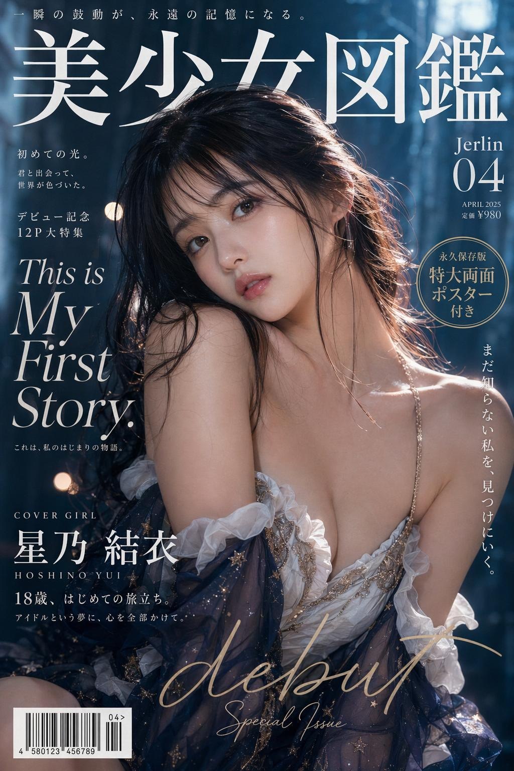
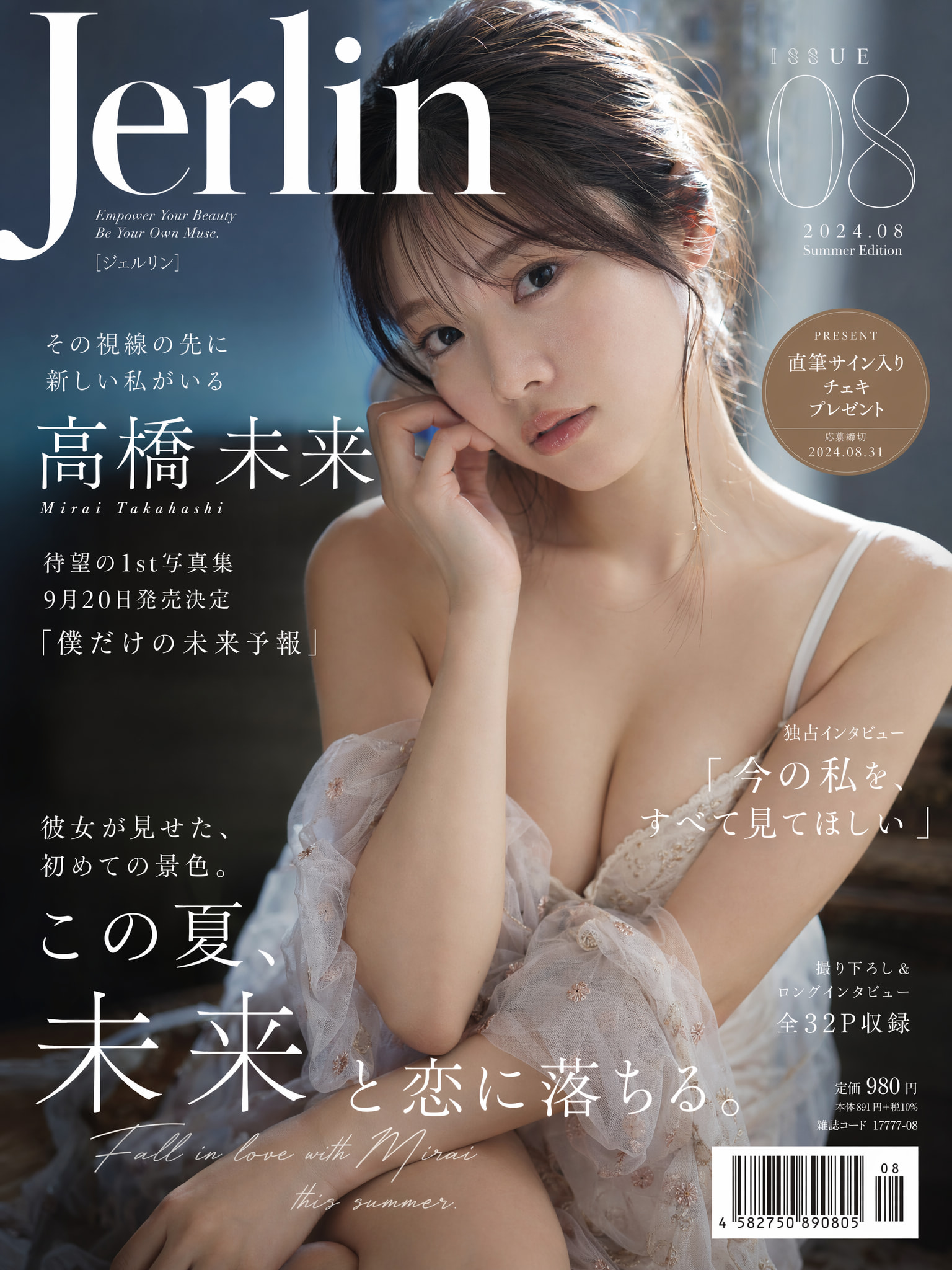
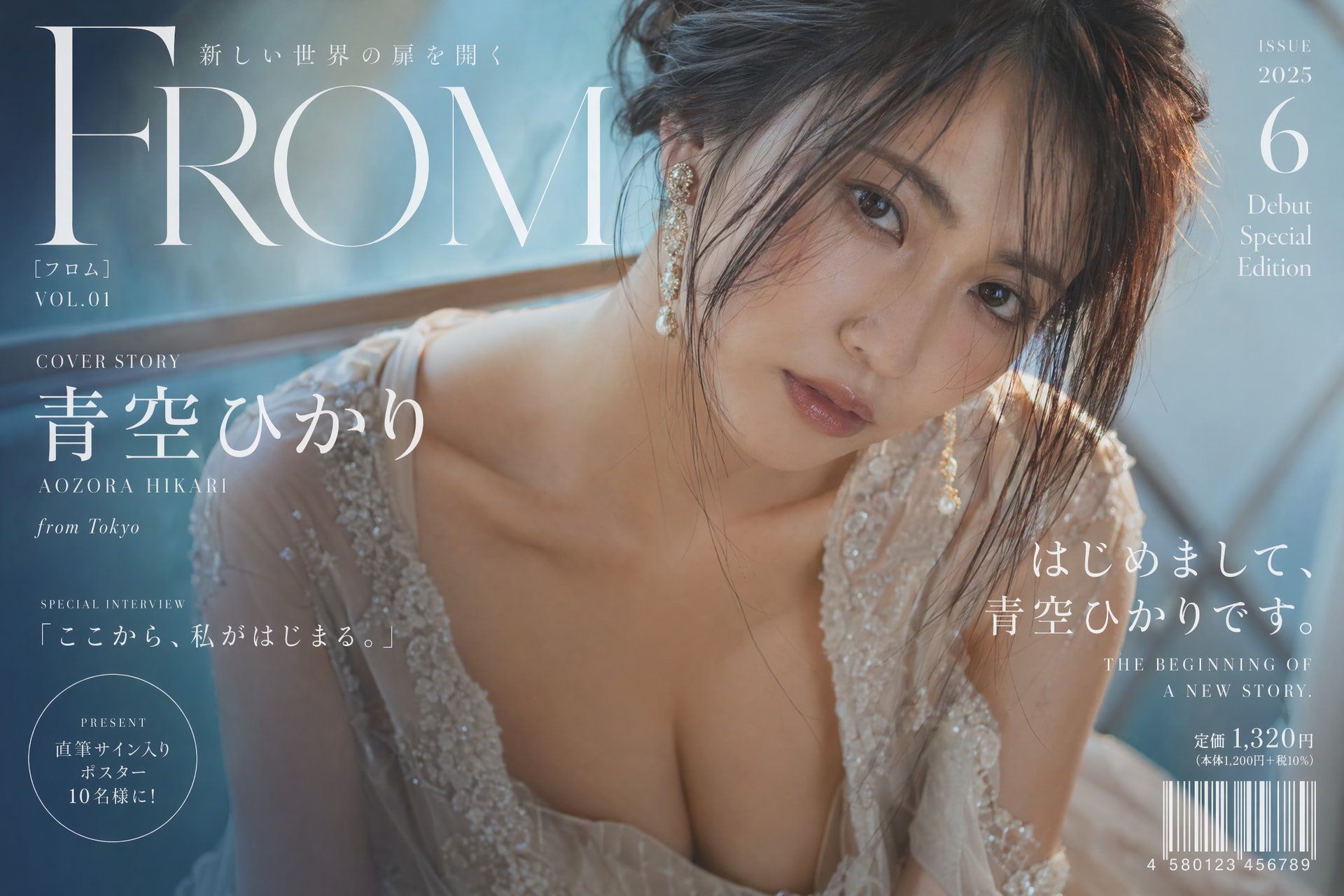
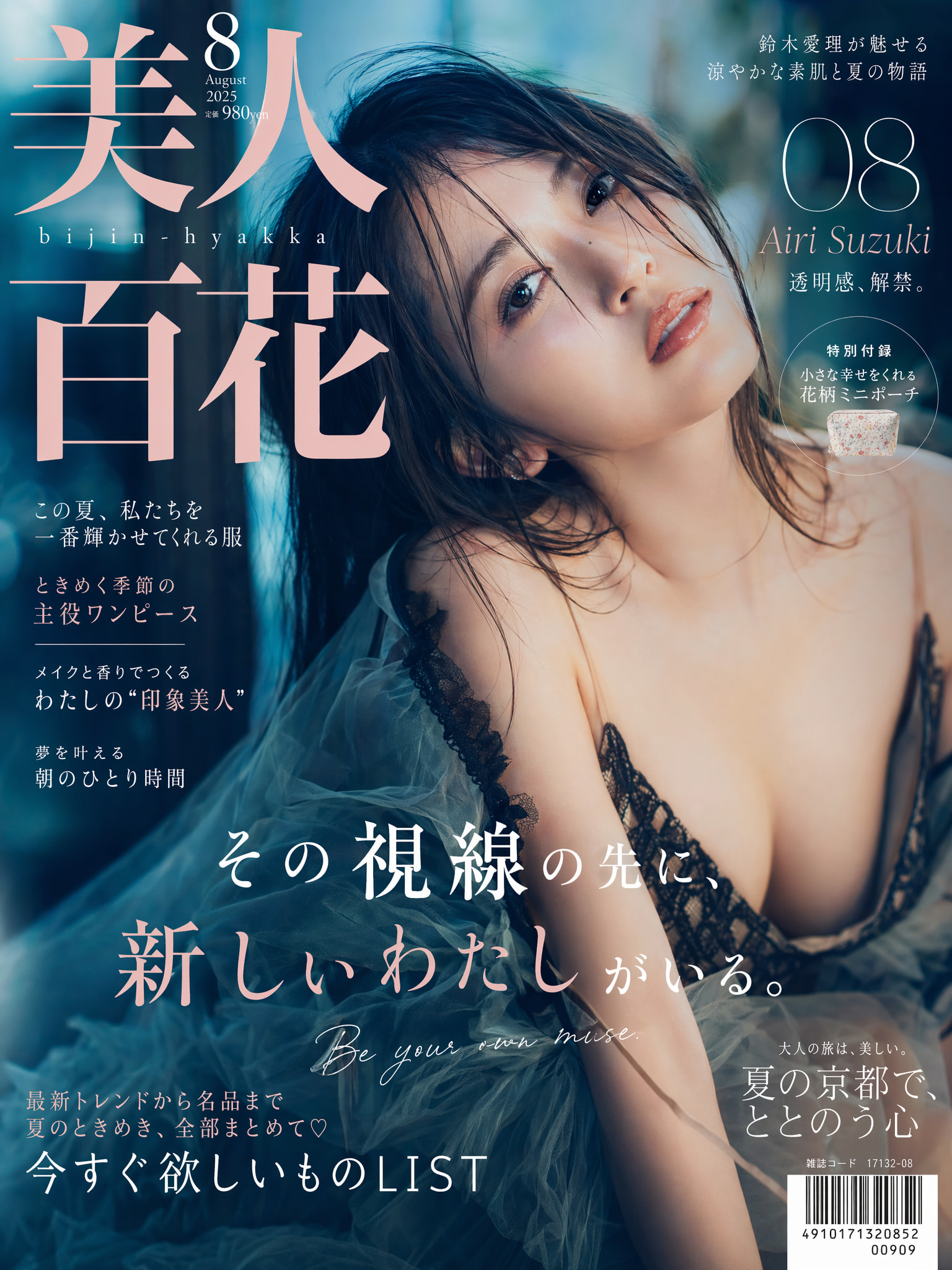
对于gpt-image-2这个模型 我的建议是最好不要用图片编辑 因为我发现这个模型的图像一致性有一点点问题 以图生图(指着图片内容让针对性修改)容易玩成抽卡游戏 我几乎都是文生图 或者上传的图只作为参考图 下面是这几张图的提示词:
`Cinematic cosplay magazine cover of Ishikawa Mio in dynamic pose, photorealistic human transformation preserving original facial features, Japanese idol debut atmosphere with intimate aesthetic appeal STYLE: High-end fashion magazine cover, dense typography layout with layered fonts and textures, commercial photography quality, pheromone atmosphere with sensual allure, high gloss finish, dramatic contrast MODEL: 8.5 head-to-body supermodel proportions with S-curve silhouette, porcelain white skin with realistic subsurface scattering, visible pores, fine vellus hair, dewy luminous sheen, voluptuous bust, defined collarbones and elegant neckline, strong feminine magnetism FACE: Japanese muse facial structure blended with Ishikawa Mio’s signature features, soft-focus gaze with inviting eyes, glossy glass-like lips, translucent skin texture, eye catchlights, natural beauty with editorial retouching POSE: Open and alluring body language, inviting eye contact with viewer, natural expressive hand gestures, intimate lover’s perspective angle HAIR: Ishikawa Mio’s signature hairstyle rendered as salon-quality real hair (no wig appearance), natural weight and gravity flow, organic flyaways, structured styling with subtle anti-gravity volume, backlit rim lighting for dimensional depth COSTUME: High-fidelity recreation of Ishikawa Mio’s original outfit, couture-level fabric translation with luxury textiles, preserving original design elements, garment-body interaction emphasizing allure, exposed skin areas with delicate luminous sheen ENVIRONMENT: Setting appropriate to Ishikawa Mio’s character world, high-budget film production design, structured yet information-rich background, subtle atmospheric haze, bokeh depth of field COMPOSITION: Vertical poster format 2:3 aspect ratio, medium to close-up framing, shallow depth of field, typography as compositional framework with model partially overlapping text layers LIGHTING: Cinematic commercial lighting setup, cool cyan environmental light combined with warm key light on skin tones, hair rim lighting, high contrast for print-ready quality TYPOGRAPHY SYSTEM: Grid-based cover design derived from Ishikawa Mio’s universe Layer 1: Japanese main title with tension and suggestive undertones (high-contrast thin serif, optional italic) Layer 2: “ISHIKAWA MIO” in romaji (medium-weight serif) Layer 3: English tagline/slogan (thin serif) Layer 4: Circular seal/badge based on character lore Layer 5: “Jerlin” + issue number (ultra-thin Didot, wide tracking, corner placement) Layer 6: Barcode + price tag Mixed typography: Japanese kanji + hiragana + romaji with descending font weights MOOD: Dreamlike, subtly sensual, intimate closeness, erotic tension, romantic gaze Negative prompt: repeated text, text shadows, glowing effects, text outlines, artificial appearance, 3D render look, oversaturated colors Aspect ratio: 2:3, magazine cover layout, professional editorial photography`
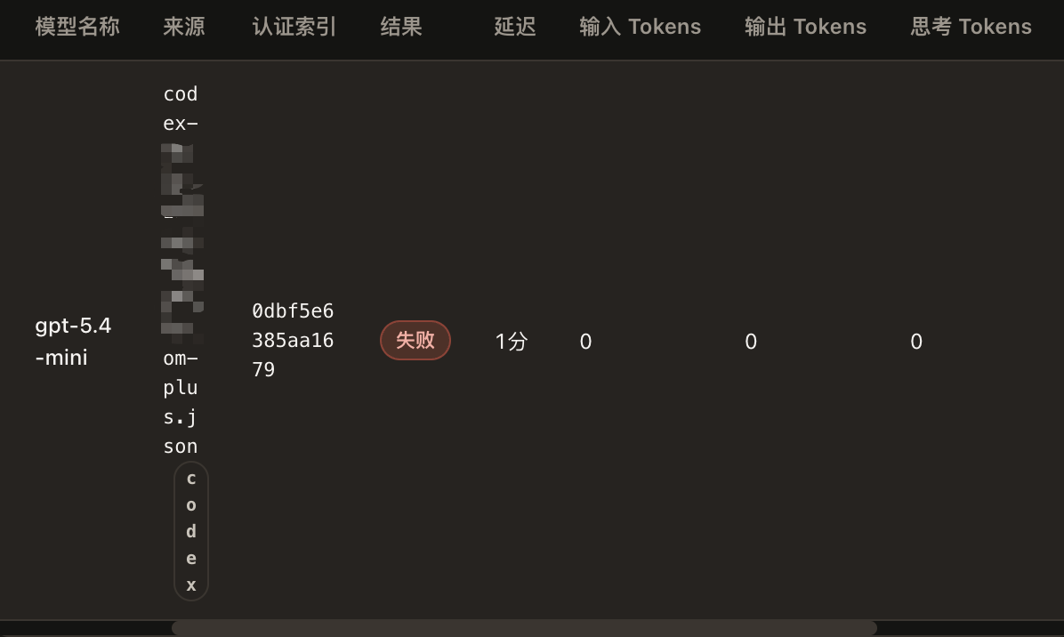
 调节内部参数,都没有效果。