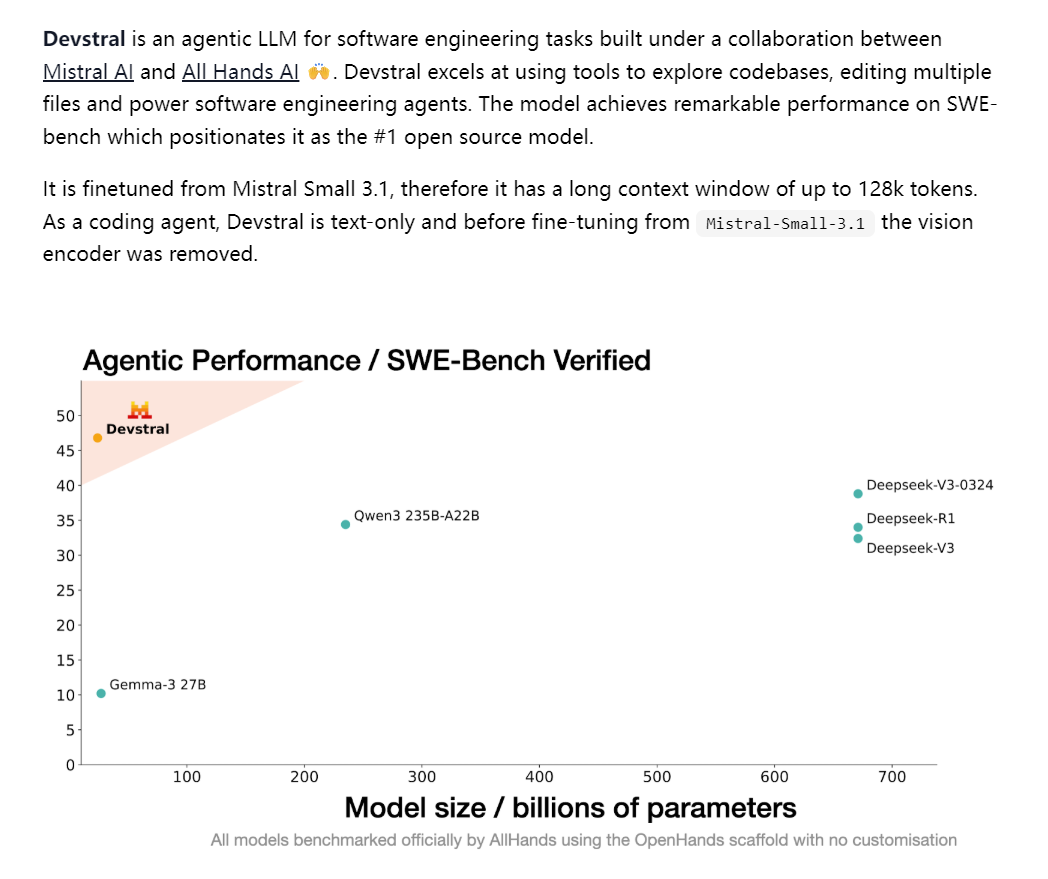
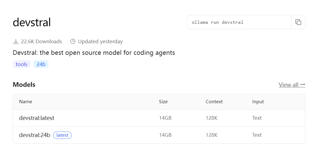
从mistral small 3.1 微调来的
测试prompt:
You are a top frontend engineer at Apple Inc. Please create an HTML file that includes CSS and JavaScript to generate animated weather cards. These cards should visually demonstrate the following weather conditions with various animation effects:

Wind (e.g., drifting clouds, swaying trees, or wind lines)
Rainfall (e.g., falling raindrops, forming puddles)
Clear sky (e.g., shining rays, bright background)
Snowfall (e.g., falling snowflakes, snow accumulation effects)

All weather cards need to be displayed side by side with a dark background design. All HTML, CSS, and JavaScript code must be included in this single file. The JavaScript section should include functionality to switch between different weather states (for example, via functions or a button group) to demonstrate the animation effects for each weather.

Optimize the frontend display effects to be more refined and smooth, creating the feel of a premium weather app worth 20 yuan per month.

Make it as long and complex as possible.
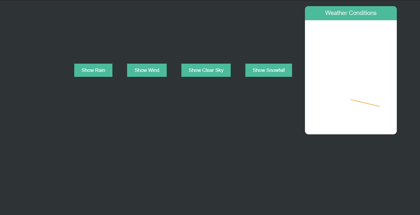
输出结果:
<!DOCTYPE html>
<html lang="en">
<head>
    <meta charset="UTF-8">
    <title>Animated Weather Cards</title>
    <style>
        body {
            background-color: #2d3436;
            display: flex;
            justify-content: center;
            align-items: center;
            flex-wrap: wrap;
            margin: 0;
            font-family: Arial, sans-serif;
        }

        .weather-card {
            width: 250px;
            height: 350px;
            background-color: white;
            border-radius: 10px;
            position: relative;
            overflow: hidden;
            margin: 15px;
            text-align: center;
            color: #ecf0f1;
            font-size: 16px;
        }

        .weather-header {
            background-color: #1abc9c;
            padding: 10px;
            border-radius: 10px 10px 0 0;
        }

        .rain,
        .wind,
        .clear,
        .snow {
            position: absolute;
            width: 100%;
            height: 100%;
            top: 0;
            left: 0;
            overflow: hidden;
        }

        .rain-line, .wind-blades, .clear-ray, .snowflake {
            position: absolute;
        }

        .rain-line {
            background-color: #1abc9c;
            width: 2px;
            height: 40px;
            top: -50px;
            border-radius: 3px;
            animation: rainFall 6s infinite linear;
        }

        @keyframes rainFall {
            0% { left: 5%; }
            100% { left: calc(95% + 2px); top: 400px; opacity: 0; }
        }

        .wind-blades {
            background-color: rgba(255, 255, 255, 0.6);
            width: 1px;
            height: 350px;
            animation: windBlow 4s infinite linear;
        }

        @keyframes windBlow {
            0% { transform: rotate(0deg); }
            50%, 100% { transform: rotate(20deg); }
        }

        .clear-ray {
            background-color: #f39c12;
            width: 1px;
            height: 80px;
            top: 50%;
            left: calc(50% - 0.5px);
            transform-origin: bottom center;
            animation: sunRays 10s infinite linear;
        }

        @keyframes sunRays {
            0%, 100% { transform: rotate(-360deg); }
            50% { transform: rotate(0deg); }
        }

        .snowflake {
            width: 4px;
            height: 4px;
            background-color: #ecf0f1;
            border-radius: 50%;
            position: absolute;
            top: -30px;
            animation: snowFall 6s infinite linear;
        }

        @keyframes snowFall {
            0% { opacity: 1; }
            100% { top: 380px; opacity: 0.5; }
        }

        .button-group {
            display: flex;
            justify-content: center;
        }

        button {
            margin: 20px;
            padding: 10px 20px;
            background-color: #1abc9c;
            border: none;
            color: white;
            cursor: pointer;
        }
    </style>
</head>
<body>

<div class="button-group">
    <button onclick="showRain()">Show Rain</button>
    <button onclick="showWind()">Show Wind</button>
    <button onclick="showClearSky()">Show Clear Sky</button>
    <button onclick="showSnowfall()">Show Snowfall</button>
</div>

<div class="weather-card">
    <div class="weather-header">
        Weather Conditions
    </div>
    <div class="rain" id="rainCard"></div>
    <div class="wind" id="windCard"></div>
    <div class="clear" id="clearSkyCard"></div>
    <div class="snow" id="snowfallCard"></div>
</div>

<script>
function createRain() {
    const rainDiv = document.getElementById('rainCard');
    for (let i = 0; i < 50; i++) {
        const drop = document.createElement("div");
        drop.classList.add("rain-line");
        drop.style.left = Math.random() * 100 + "%";
        drop.style.animationDuration = "2.5s";

        drop.style.setProperty("--start", -Math.floor(Math.random()*30)+"px");

        rainDiv.appendChild(drop);
    }
}

function createWind() {
    const windDiv = document.getElementById('windCard');
    for (let i = 0; i < 5; i++) {
        const blade = document.createElement("div");
        blade.classList.add("wind-blades");
        blade.style.top = "-30px";
        blade.style.left = Math.random() * 100 + '%';
        windDiv.appendChild(blade);
    }
}

function createClearSky() {
    const clearDiv = document.getElementById('clearSkyCard');
    let numberOfRays = 8;
    for (let i = 0; i < numberOfRays; i++) {
        const ray = document.createElement("div");
        ray.classList.add("clear-ray");
        ray.style.transform = 'rotate(' + (i*45) + 'deg)';
        clearDiv.appendChild(ray);
    }
}

function createSnowfall() {
    const snowDiv = document.getElementById('snowfallCard');
    for (let i = 0; i < 150; i++) {
        let flake = document.createElement("div");
        flake.classList.add("snowflake");

        flake.style.left = Math.random()*70 + "%";
        flake.style.animationDelay = "" + i * .2 + "s";

        snowDiv.appendChild(flake);
    }
}

function showRain(){
    document.getElementById('windCard').style.display = 'none';
    document.getElementById('clearSkyCard').style.display = 'none';
    document.getElementById('snowfallCard').style.display = 'none';

    const rainDiv = document.getElementById('rainCard');
    rainDiv.style.display = '';
    createRain();
}

function showWind(){
    document.getElementById('rainCard').style.display = 'none';
    document.getElementById('clearSkyCard').style.display = 'none';
    document.getElementById('snowfallCard').style.display = 'none';

    const windDiv = document.getElementById("windCard");
    windDiv.style.display = "";
    createWind();
}

function showClearSky(){
    document.getElementById('rainCard').style.display = 'none';
    document.getElementById('windCard').style.display = 'none';
    document.getElementById('snowfallCard').style.display = 'none';

    const clearDiv = document.getElementById("clearSkyCard");
    clearDiv.style.display = "";
    createClearSky();
}

function showSnowfall(){
    document.getElementById('rainCard').style.display = 'none';
    document.getElementById('windCard').style.display = 'none';
    document.getElementById('clearSkyCard').style.display = 'none';

    const snowDiv = document.getElementById("snowfallCard");
    snowDiv.style.display = "";
    createSnowfall();
}

document.addEventListener("DOMContentLoaded", function() {
    showClearSky();
});
</script>

</body>
</html>