从超级无敌水帖计划(随缘更新)继续讨论:
在 扫光效果浅析之卡片 文中我解析了下卡片扫光的效果,那么为了完成Done动画,还缺少最灵魂的完成打勾 环节,那么本文将对打勾动画作一个详细解析。
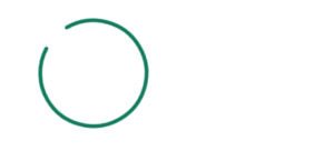
预览效果
动画拆解
初看时可以将动画拆解为以下几部分:
- 请求开始:带缺圆环原地旋转
- 请求完成:位移至中间,并变为闭合圆环
- 打勾动画:稍作延迟,中间完成对勾绘制
那么我们直接依据所分析的步骤来进行操作。
逐步实现
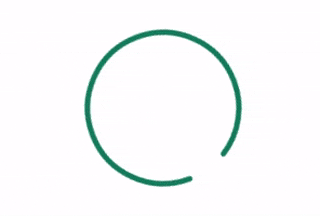
1.带缺圆环
带缺圆环绘制方法多种多样,为了能更好地配合后面的动画需求,我们就使用SVG来绘制吧,内容简单,直接手搓
<svg viewBox="0 0 150 150">
  <circle id="circle" cx="75" cy="75" r="70" />
</svg>
css样式如下:
svg {
  width: 150px;
  height: 150px;
  fill: none;
  stroke-width: 5px;
}
#circle {
  stroke: #127c5d;
  stroke-dasharray: 450;
  stroke-dashoffset: 50;
}
这里为了简洁,我省略了命名空间等其它信息,正式开发请按规范来。
展示为在大小为150x150的画布中心绘制一个半径为70的描边圆环,使用storke-dashoffset让圆环有一点缺口,此时圆环完成了,但是缺口两端的线段太过尖锐,我们也添加一些其他属性让线段顶端变圆
stroke-linecap: round;
stroke-linejoin: round;
看一下对比

下一步让其动起来,这个好办,直接旋转就行了
svg {
  // ...
  animation-iteration-count: infinite;
  animation-duration: 1s;
  animation-timing-function: linear;
  animation-name: loading;
}

@keyframes loading {
  to {
    transform: rotate(1turn);
  }
}
这里 1turn 代表一圈,相当于360度。
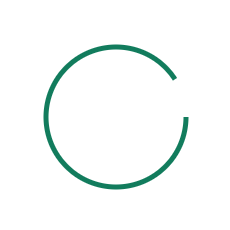
2.位移与闭合
我原以为闭合过程是位移开始或者是结束时变化的,但经过我 5倍慢速 播放录像时发现,闭合动画贯穿整个位移过程!因此,我们应当更加细化。
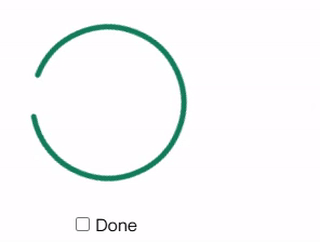
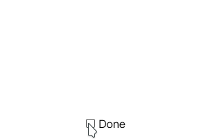
由于原动画的变化是在请求成功后开始的,所以为了模拟还原,我这里就使用一个复选框来模拟请求是否完成。
<div class="control">
  <input type="checkbox" id="done">
  <label for="done">Done</label>
</div>
// control
.control {
  position: fixed;
  bottom: 35%;
  left: 48%;
}

当复选框状态为 checked 时,模拟请求成功状态,此时我们就不需要最初的 loading 动画,而是要切换为位移与闭合动画,而位移我们是需要在整个svg上使用,闭合则是在 circle 元素上,因此我们需要将其分开
svg {
 #circle {
  // ...
  animation-fill-mode: forwards;
  animation-duration: 1s;
  transform-origin: center;
  }

 &:has(~ .control #done:checked) {
    animation-name: moving;
    animation-iteration-count: 1;
    animation-fill-mode: forwards;
    animation-duration: 0.6s;
    #circle {
      animation-name: filling;
    }
}

@keyframes moving {
  to {
    transform: translateX(200px);
  }
}

@keyframes filling {
  from {
    transform: rotate(0);
    stroke-dashoffset: 50;
  }
  to {
    transform: rotate(1turn);
    stroke-dashoffset: 0;
  }
}
注意,我们这里默认并没有给 circle 增加 animation-name,而是在请求成功input:checked 后添加,这样做可以省去设置延时,方便把控。使用 animation-fill-mode: forwards 让动画结束时保持最后一帧的样式。
此处我们使用到了 :has() 选择器,可以很优雅地根据条件来呈现样式,而不需要使用 js 来横插一杠!这在开发样式的时候非常有用!
3.开始打勾
对勾与圆环相似,我们都需要从缺口到完整的动画过程,只不过对勾的缺口初始非常大以至于隐藏起来了!我们还是先手搓一下对勾
<polyline id="check" points="40 80 70 105 110 45" />
使用 polyline 配合多点坐标来绘制,points 里面为坐标位置,可以使用逗号 , 来分隔 x,y 也可省略。
样式如下
#check {
  stroke: #127c5d;
  stroke-dasharray: 200;
  stroke-dashoffset: 200;
}
当请求成功后触发打勾动画,为其设置动画延迟,数值稍加调整,看起来丝滑就行了。
svg {
  // ...
  #check {
    animation-delay: 0.8s;
    animation-duration: 1.2s;
    animation-fill-mode: forwards;
    }
  &:has(~ .control #done:checked) {
    #check {
      animation-name: done;
    }
  }
}

@keyframes done {
  to {
    stroke-dashoffset: 0;
  }
}
至此,大功告成!看一下打勾动画单独演示
完整代码
HTML
<svg viewBox="0 0 150 150">
  <circle id="circle" cx="75" cy="75" r="70" />
  <polyline id="check" points="40 80 70 105 110 45" />
</svg>

<div class="control">
  <input type="checkbox" id="done">
  <label for="done">Done</label>
</div>
CSS
body {
  height: 100vh;
  display: grid;
  place-content: center;
}

svg {
  width: 150px;
  height: 150px;
  fill: none;
  stroke-width: 5px;
  stroke-linecap: round;
  stroke-linejoin: round;

  animation-iteration-count: infinite;
  animation-duration: 1s;
  animation-timing-function: linear;
  animation-name: loading;

  &:has(~ .control #done:checked) {
    animation-name: moving;
    animation-iteration-count: 1;
    animation-fill-mode: forwards;
    animation-duration: 0.6s;
    #circle {
      animation-name: filling;
    }

    #check {
      animation-name: done;
    }
  }
}

#circle {
  stroke: #127c5d;
  stroke-dasharray: 450;
  stroke-dashoffset: 50;

  animation-fill-mode: forwards;
  animation-duration: 1s;
  transform-origin: center;
}

#check {
  stroke: #127c5d;
  stroke-dasharray: 200;
  stroke-dashoffset: 200;

  animation-delay: 0.8s;
  animation-duration: 1.2s;
  animation-fill-mode: forwards;
}

@keyframes loading {
  to {
    transform: rotate(1turn);
  }
}

@keyframes moving {
  to {
    transform: translateX(200px);
  }
}

@keyframes filling {
  from {
    transform: rotate(0);
    stroke-dashoffset: 50;
  }
  to {
    transform: rotate(1turn);
    stroke-dashoffset: 0;
  }
}

@keyframes done {
  to {
    stroke-dashoffset: 0;
  }
}

// control
.control {
  position: fixed;
  bottom: 20%;
  left: 50%;
}
你也可以在 CODEPEN 里面查看完整代码与预览
顺便奉上一个常用的 变体版本
那么,本期结束。愣着干嘛,点赞拿走哇~ 
 隔壁老奶奶都看懂了