代码
- 代码已由 GPT-4o 进行部分修改。
- 单独把 CSS 拿出来实在不会,只好写全 HTML 了 ¯\(°_o)/¯
<!DOCTYPE html>
<html lang="zh-CN">
<head>
    <meta charset="UTF-8">
    <meta name="viewport" content="width=device-width, initial-scale=1.0">
    <title>MadokaPay</title>
    <style>
        body {
            display: flex;
            justify-content: center;
            align-items: center;
            height: 100vh;
            margin: 0;
        }

        .btn {
            background-color: #007bff;
            color: white;
            padding: 15px 30px;
            font-size: 24px;
            border: none;
            border-radius: 5px;
            cursor: pointer;
            display: inline-flex;
            align-items: center;
            justify-content: center;
            position: relative;
            overflow: hidden;
            transition: background-color 0.3s;
            width: 350px;
            height: 60px;
            text-align: center;
        }

        .btn .circle, .btn .loading-text {
            display: none;
            opacity: 0;
            transition: opacity 0.5s ease-in-out;
        }

        .btn .circle {
            border: 3px solid white;
            border-radius: 50%;
            border-top: 3px solid transparent;
            width: 25px;
            height: 25px;
            margin-right: 10px;
            animation: spin 1s linear infinite;
            position: absolute;
            left: 15px;
            transition: left 0.5s ease-in-out, transform 0.5s ease-in-out; /*过渡?*/
        }

        @keyframes spin {
            100% { transform: rotate(360deg); }
        }

        .btn.active {
            background-color: #28a745;
            cursor: default;
        }

        .btn.active .circle {
            opacity: 1;
        }

        .btn.active .loading-text {
            opacity: 1;
        }

        .checkmark {
            width: 35px;
            height: 35px;
            border-radius: 50%;
            background-color: white;
            position: absolute;
            top: 50%;
            left: 50%;
            transform: translate(-50%, -50%);
            display: none;
            opacity: 1;
        }

        .checkmark::before {
            content: '';
            position: absolute;
            top: 7px;
            left: 12.5px;
            width: 7px;
            height: 14px;
            border: solid #28a745;
            border-width: 0 3px 3px 0;
            transform: rotate(45deg);
        }

        .loading-text {
            font-size: 20px;
            line-height: 60px;
        }

    </style>
</head>
<body>

<button class="btn" id="payButton">
    <span class="text">支付 M$ 20</span>
    <div class="circle"></div>
    <span class="loading-text">正在支付……</span>
    <div class="checkmark"></div>
</button>

<script>
    var random_num = Math.floor(Math.random() * 3001) + 500;
    document.getElementById('payButton').addEventListener('click', function() {
        var button = this;
        if (button.classList.contains('active')) {
            return; // 我不知道,我知道的是你多点几下对这段代码没好处
        }

        var text = button.querySelector('.text');
        var circle = button.querySelector('.circle');
        var loadingText = button.querySelector('.loading-text');
        var checkmark = button.querySelector('.checkmark');

        text.style.display = 'none';
        circle.style.display = 'inline-block';
        loadingText.style.display = 'inline';

        // 淡入
        setTimeout(function() {
            circle.style.opacity = '1';
            loadingText.style.opacity = '1';
        }, 10);

        setTimeout(function() {
            loadingText.style.display = 'none';
            circle.style.left = 'calc(50% - 0px)'; // 移动了?
            circle.style.transform = 'translateX(0)'; // 可有可无的代码,为了稳定还是加着吧
            circle.style.backgroundColor = '#28a745';
            circle.style.borderWidth = '0';

            setTimeout(function() {
                circle.style.display = 'none'; // 旋转,然后消失
                checkmark.style.display = 'block'; // 至杨最爱的
            }, 300);

            button.classList.add('active');
        }, random_num);
    });
</script>

</body>
</html>
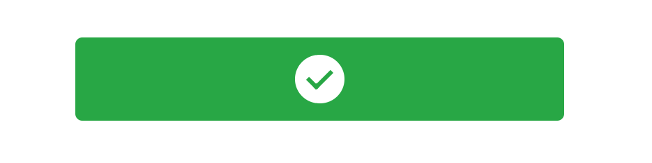
效果图
已知问题
- 愿意贡献的话可以直接使用 Wiki 的编辑在源代码上进行改动。
- 旋转圆圈向右移动会有淡出效果。
11 个赞
看看 Claude 写的 我预览没啥问题
<!DOCTYPE html>
<html lang="zh-CN">
<head>
    <meta charset="UTF-8">
    <meta name="viewport" content="width=device-width, initial-scale=1.0">
    <title>MadokaPay</title>
    <style>
        body {
            display: flex;
            justify-content: center;
            align-items: center;
            height: 100vh;
            margin: 0;
            font-family: Arial, sans-serif;
        }

        .btn {
            background-color: #007bff;
            color: white;
            padding: 15px 30px;
            font-size: 24px;
            border: none;
            border-radius: 5px;
            cursor: pointer;
            display: flex;
            align-items: center;
            justify-content: center;
            position: relative;
            overflow: hidden;
            width: 350px;
            height: 60px;
            transition: background-color 0.3s ease-in-out;
        }

        .btn .circle {
            display: none;
            position: absolute;
            left: 20px;
            width: 25px;
            height: 25px;
            border: 3px solid white;
            border-radius: 50%;
            border-top: 3px solid transparent;
            animation: spin 1s linear infinite;
            opacity: 0;
            transition: opacity 0.5s ease-in-out;
        }

        @keyframes spin {
            100% { transform: rotate(360deg); }
        }

        .btn.loading .circle {
            display: block;
            opacity: 1;
        }

        .btn.loading .initial-text {
            display: none;
        }

        .btn.loading .loading-text {
            display: block;
        }

        .btn .initial-text,
        .btn .loading-text {
            transition: opacity 0.3s ease-in-out;
        }

        .btn .loading-text {
            display: none;
        }

        .checkmark {
            width: 35px;
            height: 35px;
            border-radius: 50%;
            background-color: white;
            position: absolute;
            top: 50%;
            left: 50%;
            transform: translate(-50%, -50%);
            display: none;
            opacity: 0;
            transition: opacity 0.5s ease-in-out;
        }

        .checkmark::before {
            content: '';
            position: absolute;
            top: 7px;
            left: 12.5px;
            width: 7px;
            height: 14px;
            border: solid #28a745;
            border-width: 0 3px 3px 0;
            transform: rotate(45deg);
        }

        .btn.success {
            background-color: #28a745;
        }

        .btn.success .checkmark {
            display: block;
            opacity: 1;
        }

        .btn.success .initial-text,
        .btn.success .loading-text {
            display: none;
        }
    </style>
</head>
<body>

<button class="btn" id="payButton">
    <span class="initial-text">支付 M$ 20</span>
    <span class="loading-text">正在支付中</span>
    <div class="circle"></div>
    <div class="checkmark"></div>
</button>

<script>
    document.getElementById('payButton').addEventListener('click', function() {
        var button = this;
        if (button.classList.contains('loading') || button.classList.contains('success')) {
            return;
        }

        button.classList.add('loading');

        setTimeout(function() {
            button.classList.remove('loading');
            button.classList.add('success');
        }, 2750);
    });
</script>

</body>
</html>
<!DOCTYPE html>
<html lang="zh-CN">
<head>
    <meta charset="UTF-8">
    <meta name="viewport" content="width=device-width, initial-scale=1.0">
    <title>MadokaPay</title>
    <style>
        body {
            display: flex;
            justify-content: center;
            align-items: center;
            height: 100vh;
            margin: 0;
            font-family: Arial, sans-serif;
        }

        .btn {
            background-color: #007bff;
            color: white;
            padding: 15px 30px;
            font-size: 24px;
            border: none;
            border-radius: 5px;
            cursor: pointer;
            display: flex;
            align-items: center;
            justify-content: center;
            position: relative;
            overflow: hidden;
            width: 350px;
            height: 60px;
            transition: background-color 0.3s ease-in-out;
        }

        .btn .circle {
            display: none;
            position: absolute;
            left: 20px;
            width: 25px;
            height: 25px;
            border: 3px solid white;
            border-radius: 50%;
            border-top: 3px solid transparent;
            opacity: 0;
            transition: opacity 0.5s ease-in-out;
        }

        @keyframes spin {
            100% { transform: rotate(360deg); }
        }

        @keyframes moveAndFade {
            0% {
                left: 20px;
                opacity: 1;
            }
            100% {
                left: 50%;
                opacity: 0;
            }
        }

        .btn.loading .circle {
            display: block;
            animation:
                spin 1s linear infinite,
                moveAndFade 2s ease-in-out forwards;
        }

        .btn.loading .initial-text {
            display: none;
        }

        .btn.loading .loading-text {
            display: block;
        }

        .btn .initial-text,
        .btn .loading-text {
            transition: opacity 0.3s ease-in-out;
        }

        .btn .loading-text {
            display: none;
        }

        .checkmark {
            width: 35px;
            height: 35px;
            border-radius: 50%;
            background-color: white;
            position: absolute;
            top: 50%;
            left: 50%;
            transform: translate(-50%, -50%);
            display: none;
            opacity: 0;
            transition: opacity 0.5s ease-in-out;
        }

        .checkmark::before {
            content: '';
            position: absolute;
            top: 7px;
            left: 12.5px;
            width: 7px;
            height: 14px;
            border: solid #28a745;
            border-width: 0 3px 3px 0;
            transform: rotate(45deg);
        }

        .btn.success {
            background-color: #28a745;
        }

        .btn.success .checkmark {
            display: block;
            opacity: 1;
        }

        .btn.success .initial-text,
        .btn.success .loading-text {
            display: none;
        }
    </style>
</head>
<body>

<button class="btn" id="payButton">
    <span class="initial-text">支付 M$ 20</span>
    <span class="loading-text">正在支付中</span>
    <div class="circle"></div>
    <div class="checkmark"></div>
</button>

<script>
    document.getElementById('payButton').addEventListener('click', function() {
        var button = this;
        if (button.classList.contains('loading') || button.classList.contains('success')) {
            return;
        }

        button.classList.add('loading');

        setTimeout(function() {
            button.classList.remove('loading');
            button.classList.add('success');
        }, 2750);
    });
</script>

</body>
</html>
zjkal
9
<html>
<head>
<title>某某购票系统</title>
</head>
<body>
<sctipt>alert('请求人数过多, 请稍后再试!');</script>
</body>
</html>
1 个赞
sketu
(天源E兔)
14
<!DOCTYPE html>
<html lang="zh-CN">
<head>
    <meta charset="UTF-8">
    <meta name="viewport" content="width=device-width, initial-scale=1.0">
    <title>MadokaPay</title>
    <style>
        body {
            display: flex;
            justify-content: center;
            align-items: center;
            height: 100vh;
            margin: 0;
            font-family: Arial, sans-serif;
            overflow: hidden;
        }

        .btn {
            background-color: #007bff;
            color: white;
            padding: 15px 30px;
            font-size: 24px;
            border: none;
            border-radius: 5px;
            cursor: pointer;
            display: flex;
            align-items: center;
            justify-content: center;
            position: relative;
            overflow: hidden;
            width: 350px;
            height: 60px;
            transition: background-color 0.3s ease-in-out;
        }

        .btn .circle {
            display: none;
            position: absolute;
            left: 20px;
            width: 25px;
            height: 25px;
            border: 3px solid white;
            border-radius: 50%;
            border-top: 3px solid transparent;
            opacity: 0;
            transition: opacity 0.5s ease-in-out;
        }

        @keyframes spin {
            100% { transform: rotate(360deg); }
        }

        @keyframes moveAndFade {
            0% {
                left: 20px;
                opacity: 1;
            }
            100% {
                left: 50%;
                opacity: 0;
            }
        }

        .btn.loading .circle {
            display: block;
            animation:
                spin 1s linear infinite,
                moveAndFade 2s ease-in-out forwards;
        }

        .btn.loading .initial-text {
            display: none;
        }

        .btn.loading .loading-text {
            display: block;
        }

        .btn .initial-text,
        .btn .loading-text {
            transition: opacity 0.3s ease-in-out;
        }

        .btn .loading-text {
            display: none;
        }

        .checkmark {
            width: 35px;
            height: 35px;
            border-radius: 50%;
            background-color: white;
            position: absolute;
            top: 50%;
            left: 50%;
            transform: translate(-50%, -50%);
            display: none;
            opacity: 0;
            transition: opacity 0.5s ease-in-out;
        }

        .checkmark::before {
            content: '';
            position: absolute;
            top: 7px;
            left: 12.5px;
            width: 7px;
            height: 14px;
            border: solid #28a745;
            border-width: 0 3px 3px 0;
            transform: rotate(45deg);
        }

        .btn.success {
            background-color: #28a745;
        }

        .btn.success .checkmark {
            display: block;
            opacity: 1;
        }

        .btn.success .initial-text,
        .btn.success .loading-text {
            display: none;
        }

        .modal,
        .credit-card-form {
            display: none;
            position: fixed;
            top: 0;
            left: 0;
            width: 100%;
            height: 100%;
            background-color: rgba(0, 0, 0, 0.5);
            justify-content: center;
            align-items: center;
            z-index: 1000;
        }

        .modal-content,
        .credit-card-content {
            background-color: white;
            padding: 20px;
            border-radius: 8px;
            text-align: center;
            box-shadow: 0 4px 6px rgba(50, 50, 93, 0.1), 0 1px 3px rgba(0, 0, 0, 0.08);
        }

        .credit-card-content input {
            margin: 10px 0;
            padding: 10px;
            width: 100%;
            font-size: 18px;
            border: 1px solid #ccc;
            border-radius: 5px;
        }

        .payment-message {
            display: none;
            text-align: center;
            margin-top: 20px;
            font-size: 18px;
        }
    </style>
</head>
<body>

<div id="container">
    <button class="btn" id="payButton">
        <span class="initial-text">支付 M$ 20</span>
        <span class="loading-text">正在支付中</span>
        <div class="circle"></div>
        <div class="checkmark"></div>
    </button>

    <div class="payment-message" id="paymentMessage"></div>
</div>

<div class="credit-card-form" id="creditCardForm">
    <div class="credit-card-content">
        <h2>信用卡信息</h2>
        <input type="text" id="cardNumber" placeholder="卡号" value="4111 1111 1111 1111">
        <input type="text" id="expiryDate" placeholder="有效期" value="12/24">
        <input type="text" id="cvv" placeholder="CVV" value="***">
    </div>
</div>

<div class="modal" id="modal">
    <div class="modal-content">
        <p>已从浏览器自动读取信用卡信息</p>
        <button id="confirmButton">确定</button>
    </div>
</div>

<script>
    document.getElementById('payButton').addEventListener('click', function() {
        // 显示信用卡表单和弹窗
        document.getElementById('creditCardForm').style.display = 'flex';
        showModal();

        // 自动填充后2秒继续
        setTimeout(function() {
            document.getElementById('creditCardForm').style.display = 'none';
            document.getElementById('modal').style.display = 'none';
            continuePayment();
        }, 2000);
    });

    function showModal() {
        document.getElementById('modal').style.display = 'flex';
    }

    document.getElementById('confirmButton').addEventListener('click', function() {
        continuePayment();
    });

    function continuePayment() {
        var button = document.getElementById('payButton');
        var paymentMessage = document.getElementById('paymentMessage');

        // 模拟支付过程
        setTimeout(function() {
            button.classList.add('loading');
            paymentMessage.style.display = 'block';
            paymentMessage.textContent = '正在支付 $999,999,999...';

            setTimeout(function() {
                paymentMessage.textContent = '支付失败,余额不足,正在使用信用额度...';

                setTimeout(function() {
                    button.classList.remove('loading');
                    button.classList.add('success');
                    paymentMessage.textContent = '$999,999,999 支付成功!';
                }, 2000);
            }, 2000);
        }, 1000);
    }

    // 防止关闭标签页
    window.onbeforeunload = function() {
        return "您确定要离开此页面吗?";
    };

    // 禁止关闭标签页并阻止通过快捷键关闭
    document.addEventListener("keydown", function(event) {
        if (event.ctrlKey && event.key === "w") {
            event.preventDefault();
        }
        if (event.key === "F5" || (event.ctrlKey && event.key === "r")) {
            event.preventDefault();
        }
    });

    document.addEventListener("visibilitychange", function() {
        if (document.hidden) {
            alert("无法切换或关闭此页面,支付过程正在进行中!");
            document.location.reload(true);
        }
    });
</script>

</body>
</html>
千万别运行


 zhiy的c病有救了